The composition above was created in a Graphic Symbolism course at South University. The objective of the task was to design a composition that is something that would be viewed in a dream. So I conceptualized the above design. In order to formulate this piece I used Adobe Photoshop and I used four images. This layout is comprised of and image of a snake pattern, crocodile eye, a hole in a wall, and finally a human face. The tools used to complete this project were the wand tool, adjustment layers, the opacity bar, the eraser tool, and a couple of other tools. After using all of those items I was able to come up with this finishing product that got me an "A" for the assignment.
Frico Sludge is a made up advertisement for coagulated refrigerator sludge. The purpose of this assignment was to pick from a list of either disgusting or dangerous items and advertise them in a way to mislead your audience into believing that there's absolutely nothing wrong with the product. To accomplish completion of the job I used Adobe Photoshop and four photographs to get the message across. The brainstorming on this piece wasn't very difficult, but it was a bit of challenge seeing as I had to make something as repulsive as coagulated refrigerator sludge seem harmless. Typeface treatment, color, outer glow, opacity levels, and photo manipulation were all utilized to create what you see before you. This assignment also received a good grade.
Wednesday, February 19, 2014
Blog 5 February 12, 2014 | Vengeful Vamptress Series
These are mock ups of a book design that I created for a Collateral Design class. The object of the project was to make up a book series consisting of three volumes. It may sound as simple as that, but it surely wasn't. Conceptualizing took a huge portion of the time for this particular project as well as photo manipulation and treatment. Photoshop was used for the entire project as well as tons of foam core boards and . It took about five weeks to complete because I was required to create a made up book series, (which again took a lot of brainstorming) design the layout as well as appearance of each individual book, and build a three dimensional mock up of each one. Even though this project took an exorbitant amount of time the job got done and the project received positive commentary from South University professors and students. I was actually asked if I was selling the books that you see above. The people inquiring about the books were under the impression that they were real and were willing to pay for them.
This is the first volume. For this composition I put a lot of time into the woman. I used the air brush tool, the blur effect and a couple of adjustments to the highlights/shadows to the image to give off the impression that the woman featured on the cover is a vampire.
This is the second volume. Although I had to put in many hours on the woman on the cover as I did with the first book, with this design I had to spend even more time placing the two images (the vampire and the ballroom) in a visually appealing manner. That meant I had to consider the placement of the title also.
Lastly, this is the third volume. This final book took up the majority of my designing time because I used three different faces on the cover and each image had to be manipulated so that every individual guy looked like a vampire. After morphing the male images into male vampires I cropped them accordingly and turned the opacity down on all of the eye photos.
Monday, February 3, 2014
Blog 4: January 27, 2014 | Panda Lilly
This is a character that I made in my Digital Illustration course at South University. The professor wanted us to draw out thumbnails of many facial expressions and then come up with a character to apply the 3 expressions to. So I came up with the illustration above the text and named her Panda Lilly. I utilized the scanner in the art lab to scan in the outlines of each different expression/body language of Panda Lilly. Next, I did a trace image on each illustration separately, chose the colors from the swatches panel, used the gradient tool some (especially in the faces of Panda Lilly to the left and right), and finally used the blob tool to actually color them in with my selection of colors. The object of this project was to focus more on hand drawing the illustrations and not always relying on the computer to come up with great visuals. The professor expressed that I did an extremely good job with this task.
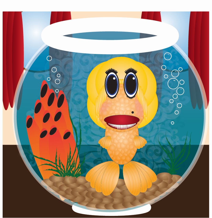
Blog 3: January 25, 2014 | Marylin Monroe Goldfish Monster
This project really tested my ability to use critical thinking. What you see before you is a fictitious Marylin Monroe gold fish monster. The purpose of this project was to overcome limitations. The professor requested that for this project we illustrate a monster in Adobe Illustrator only using the elliptical tool and color. The only thing that was allowed to be done without using the elliptical marquis was the two colors (beige and brown) you see in the background. After doodling around in Illustrator I stumbled upon the idea above this text. So to complete this project I used various sizes of circles, gradient fills, transparent circles, distortion, warping, and finally placement of everything to compliment one another. After completing the task at hand, I turned my project into the professor who later on gave me good praise on my work.
Subscribe to:
Comments (Atom)


